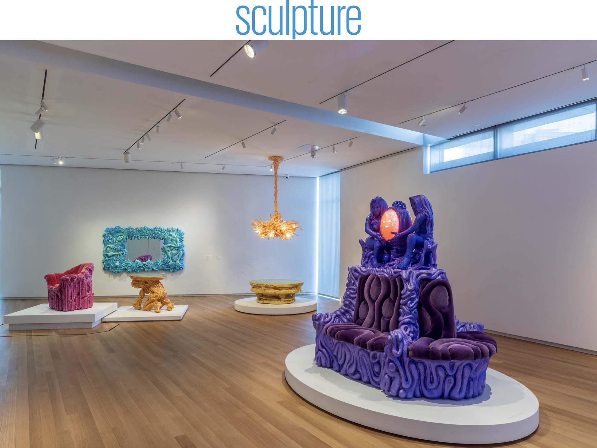
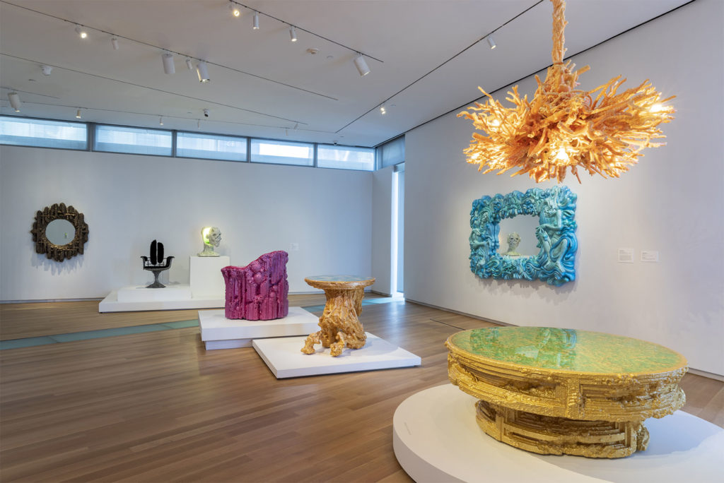
Born in 1975 in Pittsburgh, Chris Schanck grew up in Dallas. He received a BFA in sculpture from the School of Visual Arts and an MFA in design from Cranbrook Academy of Art. Since 2011, he has lived in Detroit, where he founded a studio employing more than a dozen artists, students, and craftspeople. His highly sculptural furniture is currently the subject of a major exhibition, titled “Off-World,” at the Museum of Arts and Design in New York. Schanck spoke with Sculpture about the last piece he finished for the show, cemeteries as public art, and how he sees his practice as a kind of Trojan Horse.
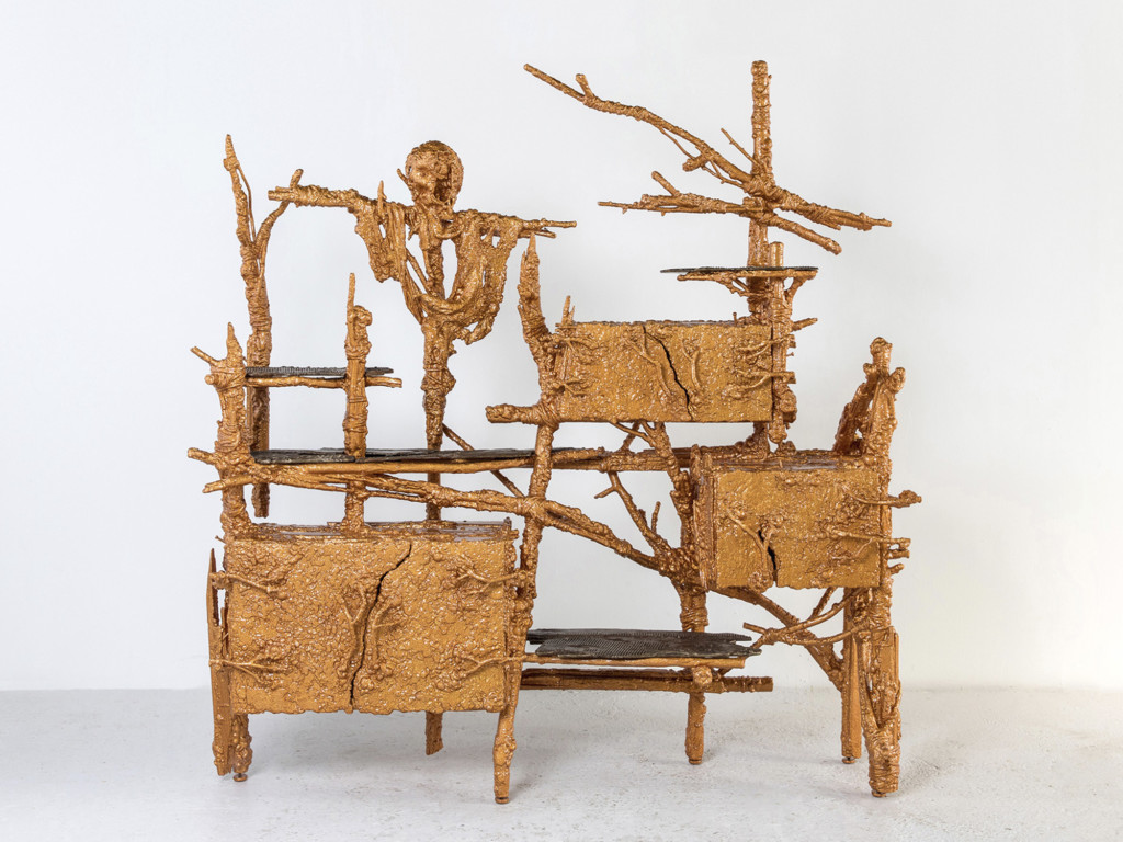
Sculpture: Tell us about the origin of Mortal Bench.
Chris Schanck: Mortal Bench came later in the evolution of the show. The show was originally conceived about three years ago. The good thing about having two or three delays due to the lockdown was that it gave me more time to consider what to do. I had an initial concept of the overall arc or set of themes to explore, but that was not what I ended up doing. The show started with a title, which was “Off-World,” which sort of encompassed the vibe of the work and where it was going. I originally took that title from science fiction literature of the ’50s, and it means something like non-native to the planet earth, whether it qualifies as life or not. And it took on an additional meaning, which was most relevant to this piece, and to me it was something of a revelation. “Off-World” was another way to describe the last thing we would do, that all of us would do as people, and that’s die—to take the trip to the afterworld, however one wants to interpret that.
I was already working on the archetype of communal seating, and I was looking at interior historical references, from modern mall seating to 16th-century French settees. But I also have an interest in public seating in cemeteries, if we can put cemeteries in the category of public art, for the sake of the conversation, especially cemetery statuary, which is often elevated—we have to look up at it. On one level, Mortal Bench is a beta test for my most ambitious project, one I’ve only begun in my head. I’ve always thought of public art as the highest form of art. One way I’d like to demonstrate that is with a functioning cemetery as a design and sculptural project—everything you’d think of in a cemetery, from the entrance to the fencing, to the stones, to the landscaping, even taking into consideration the ideologies of the people entering it. I’m working on having my immediate family sign off on being involved in the project, after their deaths. I’m also working on a description of who else would be eligible, but it would be pretty open. So Mortal Bench is a beta test for that. Obviously the piece is intended for an interior, but you could reimagine this form in cast concrete or granite or whatever. We were in the middle of the pandemic, and I almost hate to relate the pandemic to the generation of this work, but there’s no way around it.
Sculpture: How do you begin a piece?
CS: My practice is based in drawing. It’s the only truly personal and isolated part of my practice. I do it at home, away from the crowd of the studio. The lockdown gave me time to burrow into my drawing practice in a way I hadn’t been able to in probably 10 years, since grad school. Things come out, they flow in a way that is emotional rather than intellectual—there’s a hand-mind connection that’s beyond my skill set to understand.
Sculpture: What was the inspiration for Mortal Bench?
CS: I started drawing this public piece, Mortal Bench, and wanted to add symbolism to it. If we look at the plan from above, each position on the settee angles outward. You can turn to speak to the person next to you, but really your gaze is straightforward; it is directed out at the world, meaning it is individual, rather than about conversation.
During the pandemic I began calling my grandparents. They’re in their 80s, and I didn’t know if I was going to see them again, so I took the opportunity to have some lengthy conversations about them, from their time growing up to where they see themselves in the world today. These are two working-class folks from Pittsburgh, who lived through their own virus/plague, which was polio. There was no cure, and you never knew who was going to get it—this was a constant threat that went on throughout their adolescence. They said we’ve experienced these types of things throughout history, and now it’s your generation’s turn.
Their take on it got me thinking about the historical aspect and looking back to the Black Death, the plague. There was a series of three great plagues that occurred during the middle to late Middle Ages. They were clueless about what to do: they got the science almost completely wrong, but the symbolism was entirely correct. Part of that symbolism, under the umbrella of memento mori, was Death and the Maiden, which first appeared in Germany and then throughout Europe. It’s a simple motif of the Maiden on one side, usually portrayed as young, beautiful, perhaps erotic, and on the other side, Death coming to collect her. It’s very clear in its depiction—maybe not the most sophisticated interpretation of the message, but I think that’s part of the intent. Sometimes the simplest forms are the ones that communicate the most with the masses. Looking back at the symbolism that took hold over centuries would be more effective than trying to create a new symbolism—I was leaning on the power of the historical reference.
Sculpture: Tell me about the oval light between Death and the Maiden.
CS: Ah, the light. In the early Renaissance, grotesques—those masks you find inscribed on the outside of buildings, on churches, of the time—were exaggerated faces, scary, bizarre looking, quite unexpected, which goes along with the idea that furniture and forms of the past were more radical and mystical than they are today. When people look at my work and say, “How odd,” I’m like, “Have you looked at some of the stuff that people were doing 500 years ago?” It’s way fucking stranger than what I do. What I do is just brighter and in different colors. They knew more about this spiritual world, this battle between living a secular life and a religious life. I don’t think I’m doing anything new in that sense; it’s an interpretation of things that artisans have been trying to work out for hundreds of years.
The grotesque, the face, was an adaption to Death and the Maiden, and it comes from other pieces I was working with, which I incorporated. I’ve done two table-top lamps (one is in the show) with grotesque faces, but they take their cues from the pop-culture references that I grew up with. To me they’re a combination of a xenomorph, which would be Giger-esque (H.R. Giger created Alien), orcs in the Lord of the Rings books and films—more pop-culture manifestations of monsters that I find relatable. The outside of the lamps is the grotesque, and they illuminate as you open them. They function as a lamp, but not an extremely efficient one. It’s more of a symbolic light. The grotesque on the outside is a monster to scare away other monsters, and the lights are dim and subtle. I even called the first one Night Light, in the sense that it’s a form meant to scare away the existential threats that keep you up at night. The idea is that it can function on this emotional level—no idea if that’s successful or not. Beginning with the Industrial Revolution, furniture design and manufacturing materials have become extremely sophisticated, and we can create many things cheaply. But what else can furniture and domestic objects do for us?
Historically you would just see the two—Death and the Maiden—but I put the light in the middle. They’re both meant to be holding up this protective light to ward off the fears and existential threats through the journey of life. I’m 46, I’m not 26 anymore, and my thoughts go more and more toward mortality and how much time I have left. For me it’s measured in shows: how many more exhibitions I can make, how many more works of art I can create, and how many of those can be actually meaningful to me firstly. If I believe it to be a version of the truth and I know how to explore it, that’s the best chance to reach an audience.
Sculpture: How did you create the figures?
CS: The figures were hand-sculpted. In my heart I’m a sculptor. When I drew them, they were a difficult subject matter to take on, because they have to be representative of something. You can’t just throw figures out there and not have an idea of what they’re doing. That might be the first time I’ve worked that way, even though I had a great education in life drawing and a competent understanding of the body. But it was definitely a formal challenge to my skill sets. It was the last piece I made for the show because I was afraid of it for a year.
Sculpture: What did you sculpt them in?
CS: The figures are pure foam. It’s slightly higher-density foam that can pick up a bit more detail. And if you look closely there are cloths draped across the figures, and those are actual cloths we coated in resins, which were then hardened. The form makes you back yourself up with an idea or a narrative, and there’s much more that I want to say where those narratives become more personal.
Carving the figures in three dimensions was the most ambitious. There is a figurative piece in the show, the Sylvia Plath mirror, which is in relief, and that was kind of step one. I work very traditionally: I made two small clay maquettes to understand it in three dimensions, and then started to carve a block by removal—with lots of fuckups, but the material is so forgiving, you just chop a piece off, put a new block on, and sculpt again. Furniture takes a long time and is extremely expensive, at least the type I make, so wherever I can find expediency without sacrificing meaning, I’m quite happy.
Sculpture: Do you ultimately see your pieces as sculptures?
CS: There’s this difference between the piece being a functional and a sculptural object, and this is just a constant question that designers like myself who dabble between both worlds get asked. Are you a designer or an artist? Is this design or art? I didn’t know how to address these questions early on because my training was in very traditional fine arts. My goal since I had any sort of consciousness was to be an artist, and I studied that as earnestly as I could from adolescence. I attended an arts magnet high school, which really nourished my talents. I grew up in a by day working-class, and by night proletarian family; we were a good family, but we literally exchanged the labor of our bodies for money. I went to New York to study painting and sculpture at the School of Visual Arts, and at some point I had a crisis of faith in what I was doing as an artist and slowly made this transition into design, with the intent of doing something meaningful, actually contributing to society in some way other than culturally. At the time I was inspired by whoever came up with the curb-cut in the sidewalks, so people on bicycles and in wheelchairs could access sidewalks like the rest of us. It’s something important and ubiquitous, but we don’t really care about the author.
That was my intent going into design; I learned a lot in trying it but utterly failed. I’m just not wired that way, for noticing those things in the built environment. I settled back into what I know best, and that’s expressing things through form and sculpture. Design meant for me, conceptually, that I could make sculptures to touch and interact with, and that could be in the home, not relegated to institutions. I’m getting to this art and design dilemma, where my first instincts, especially coming out of grad school, were almost for arguing, “What’s the difference?” Why are we making such a big deal about this? Every show or interview I had at the beginning of my studio this always came up, and it continues to come up, whether you’re talking about it intellectually or from a market point of view. I think it’s a market-driven question, keeping the design and art world separate through fairs and auction houses, so each of the powers that be can control those markets. But there’s definitely increasing fluidity with each new generation. Look at Gen Z and gender issues. That’s a somewhat good metaphor for how artists operate: they don’t fit neatly in boxes, they move around culture with relative ease, they make connections that others tend to overlook, and the good ones point to things we may be overlooking and even prophesize where we may be going. Artists have always been fluid, at least the good ones.
That’s the pro argument for art and design coming together in a real way. These things are blurring, and everything is so damned confusing and overlapping, and the persistence of the old guard maintaining the difference between art and design will be a battle that they will eventually lose, just because the generations to come will stop seeing these distinctions as so formal. That’s my guess, and you can already start to see it. Maybe I’m the precursor to that movement. In my mind, I’m an artist who found his medium in making artifacts, furniture specifically.
But to play devil’s advocate, what are the differences between art and design? I lament the fact that my education was fine art-specific and I wasn’t exposed to radical design thinking until I was in grad school—it’s crazy to me that this whole parallel universe existed that I didn’t know about. But surely there must be some attributes of design that art doesn’t have or isn’t as good at, and vice versa. Here’s a simplistic idea of experiencing art. When I have an experience of art in a gallery or museum, either the artist is a good or bad communicator or I am not emotionally mature enough or sophisticated enough to understand what they are saying. Sometimes I connect and sometimes I don’t. But we don’t expect as much from design, especially contemporary design. I’m not talking about the elite, but the general population, which values innovation over beauty and aesthetics. And furniture is more of a passive object in the home. It’s not there to teach you or make a statement. But I saw the potential in furniture because we expect so little of it, beyond working for us: it could act as a Trojan Horse entering the domestic or the community environment, if I could somehow embed other meaning, storytelling, symbolism, morality, myth, narratives that would be somewhat unexpected or subversive, and maybe not at first noticeable. Because the other advantage you have with furniture is the amount of time you spend with it. I don’t know what the average time even an educated person spends with an artwork, but it’s not very long—if I recall, certainly under five minutes, probably under one minute. But if you can get a piece of furniture in the home, you’re talking about the possibility of a generational engagement, or a multi-generational engagement, daily or somewhat daily. I would say that Mortal Bench is comparatively hitting you over the head with what I’m talking about now. You could work narrative into these things, more meaning that could be revealed, explained, or shared over time, and not need to have the immediate impact or even that “wow” factor that’s followed in art by, “What is it?” I’m attempting to explore that territory as is, embrace the idea that I am a designer.
I’m beginning that process of trying to understand narrative and form in the home—in the case of the Sylvia Plath mirror, by telling somebody else’s story, but a story I relate to. One of the beauties of art is that I look to it to express things in mediums in which I can’t express myself: I can’t write worth a shit, I can’t sing a tune. When someone else can summarize a feeling that you are having in another medium, whether it’s joy or in this case major depression, it’s comforting, like a warm fucking loving blanket.
“Chris Schanck: Off-World” is on view through January 8, 2023.
