By Glenn Adamson
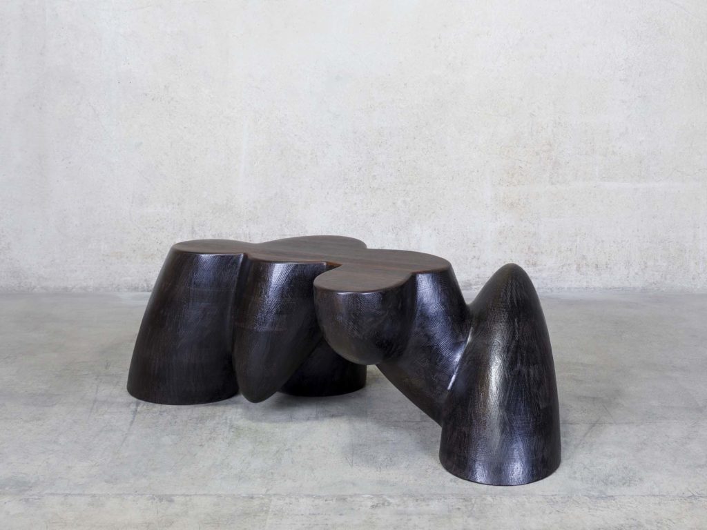
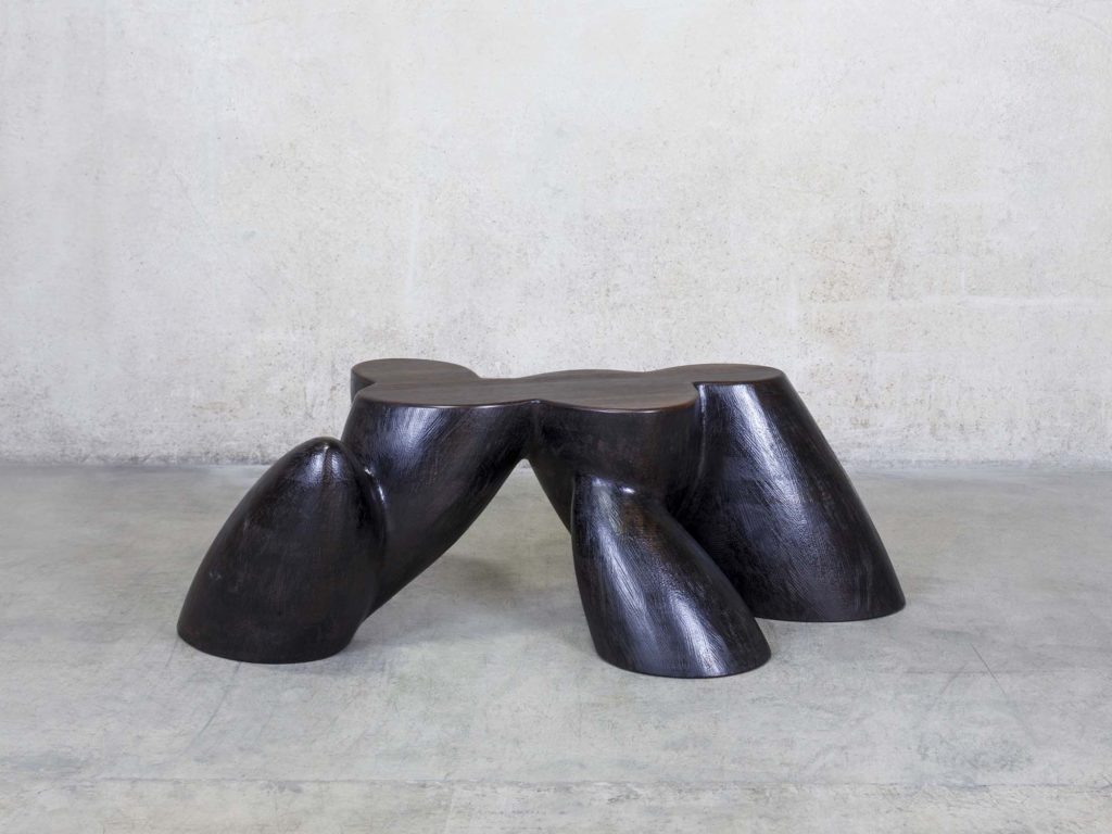
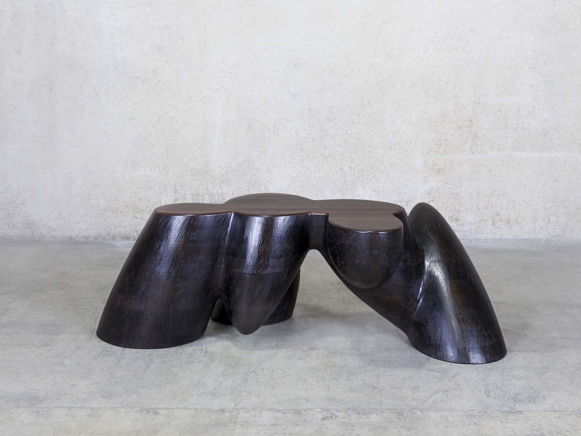
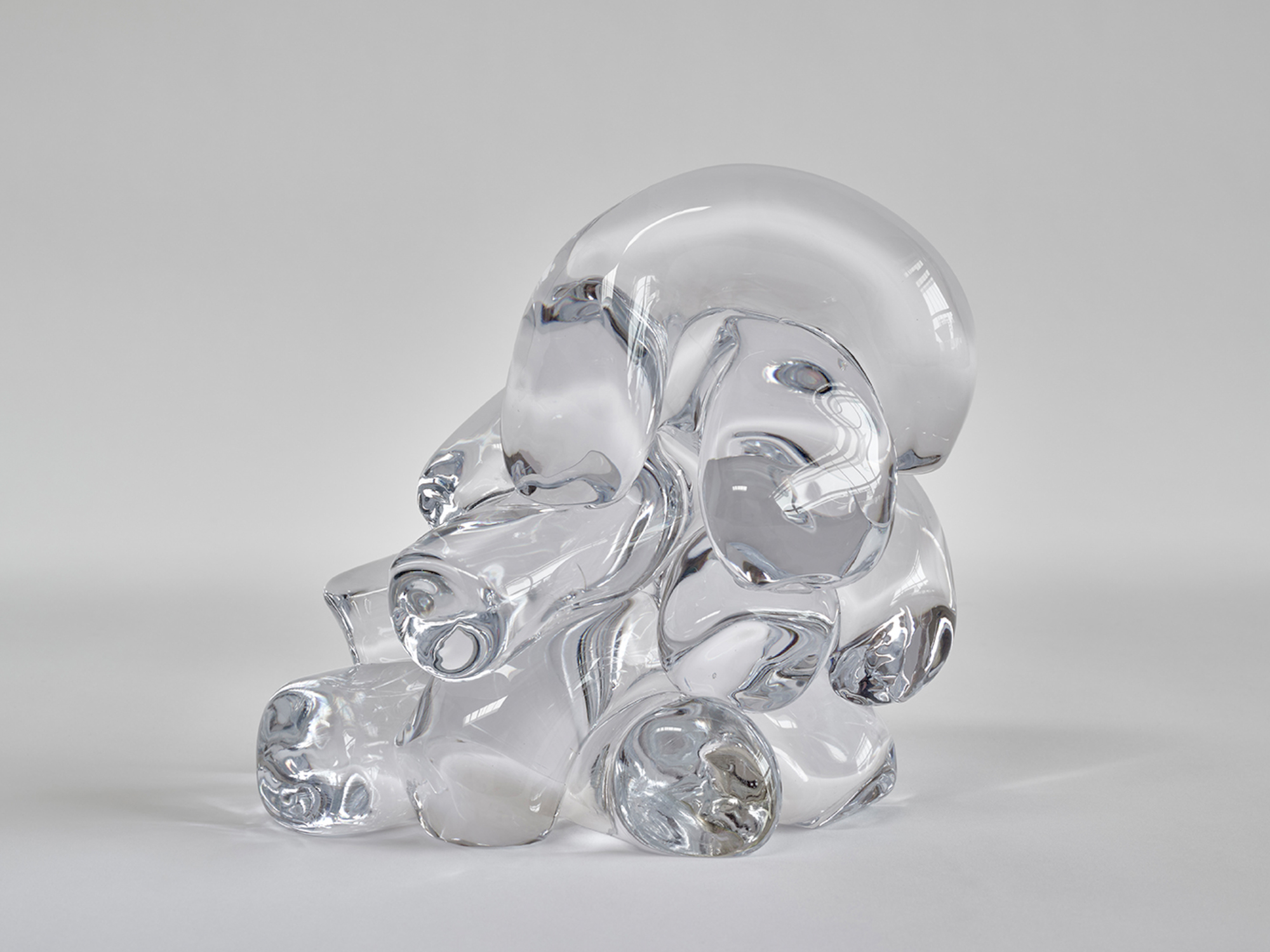
A mountain range, partly inverted. The cross-section of some strange quadruped. A molecular model showing conjoined atoms. A group of friends, meeting. These are some of the associations that come to mind, when looking at Wendell Castle’s The Way It Should Be.
It is a masterful example of his late idiom, made from a hand-carved model using robotic CNC, which enabled him to create unprecedentedly complex shapes, all but impossible to execute with conventional means.
The table has six interpenetrating volumes, each one of compound curvature. No two are identical in silhouette. Some are cropped, some fully rounded. Two drop down toward the floor, three rise up from it. A final shape is lodged in the middle of the composition, holding it all together, like a bridge, or a beating heart.
The table stands in a typological lineage, surprisingly central to the story of modernist furniture, stretching back to the biomorphic tables of T. J. Robsjohn-Gibbings and Isamu Noguchi. Like those two midcentury masters, Castle realized that the low height of a coffee table, and the central position it usually occupies in a room, makes it a perfect opportunity for exploring organic form.
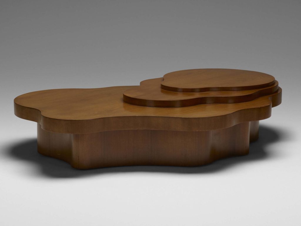
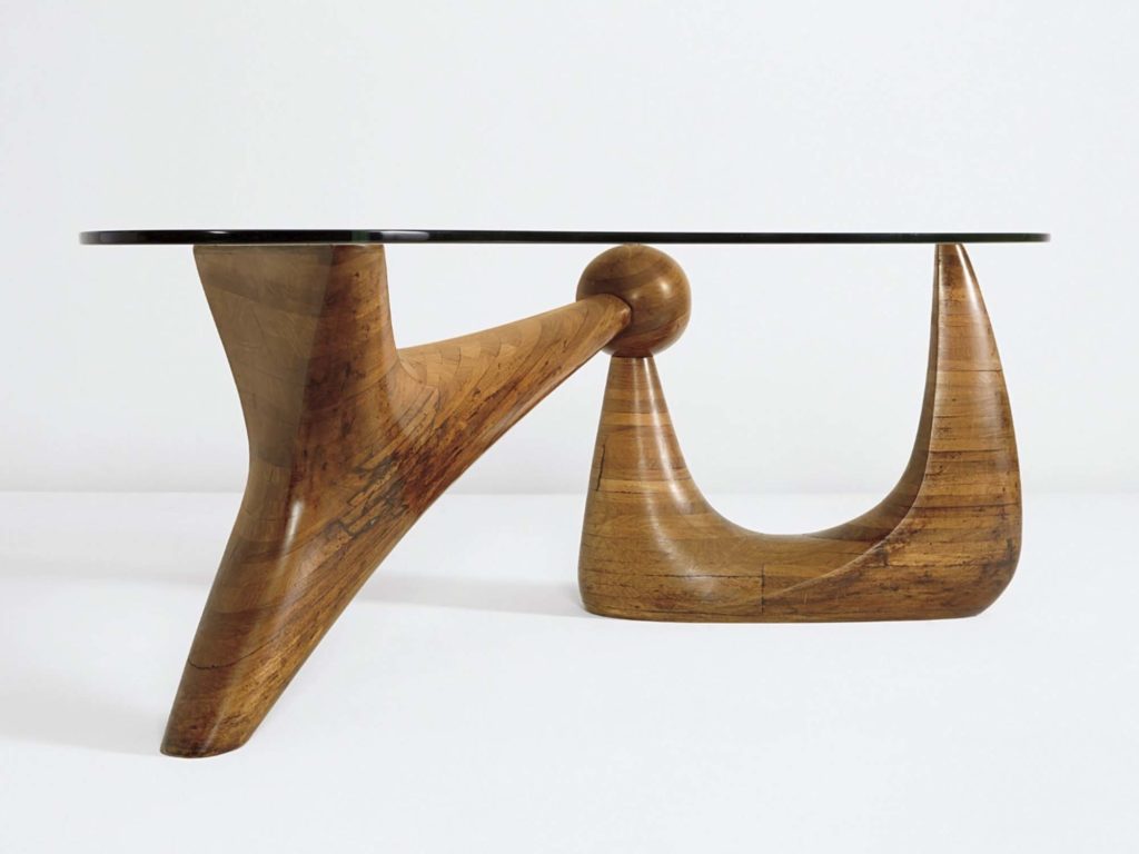
There’s not a straight line in this work, unless you count the horizontal planes of the top and floor, which slice across the form, highlighting its compressed musculature. Castle has emphasized this by topping the table with figured rosewood (from a cherished stock of the exotic timber, and a nod to elegant furnishing of the past). The remainder is in stained ash, a material he preferred for its strength and relatively consistent grain structure. The result is in an emphasis on constructive geometry, rather than the timber itself.
The title could be read as self-referential. The table is unsurpassed, among his late works, in its sculptural conception. Design should indeed always be this way, or at least always this good. Given Castle’s customary modesty, though – a trait instilled into him in his Midwestern upbringing – it is perhaps better to interpret the phrase in more oblique, narrative terms. The Way It Should Be: the words evoke a certain yearning, a striving for perfection.
That, of course, was another aspect of Castle’s personality. He never stopped searching for new ideas, and always reached for their ultimate expression. Amazingly often, he achieved that ideal, and never more so than in this table. Imagine him, having just completed it: stepping back and taking it in from every angle, and laying down his tools; completely satisfied – if only for a moment.
